AMAZON multi-meters discounts AMAZON oscilloscope discounts
The graph is one of the most effective tools of communication that any technically trained person can wield. With a graph, one can bring order to a collection of data and present it in a picture form that tells a story. Also with a graph, one can compare the performance of two or more related items or processes and may be able to make certain computations not practicable by algebra, analytic geometry, or calculus. In development and research the graph is used to deter mine the relationships of two or more variables, to compare laboratory data with theory, and to determine if test data are accurate and reliable.
Because this information must be presented honestly, accurately, and as clearly as possible, skill and judgment are required to make a good graph. Therefore, an engineer or drafter should develop as much skill and knowledge within this area as in any other area or type of technical drawing. The fundamental principles of graphical representation are:
1. Graphs should be truthful representations of the facts.
2. Graphs should be clear and easily read and understood.
3. Graphs should be so designed and constructed as to attract and hold the attention.
FIG. 1 is a good example of a well-drawn technical or engineering type of graph.
1 General Concepts in Preparing Graphs
One of the most difficult problems in constructing a graph is choosing the horizontal and vertical scales. As an example of this problem, FIG. 2 is presented. In this figure the same “curve” is shown on four different graphs, each having different arrangements of scales; thus, it may be difficult to recognize that the same data are being presented. Graph a is the best of the four for two reasons: (1) the data are presented more honestly, and (2) better use is made of the available space than in any of the other three drawings. This problem of the selection of scales can often be solved by using commercially prepared graph paper and making wise use of the space available. However, it may not always be possible or desirable to use such paper.
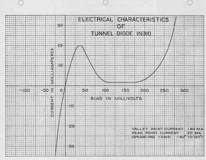
FIG. 1 A typical graph, plotted on rectangular coordinate paper.
Another problem in graph construction is deciding what type of graph to make. In other words, the problem might be, “What type of graph paper should be used?” There are many different types of graphs in use today, and many different kinds of graph paper. Most graph papers are printed on 8 X 11-in. paper, although larger sizes are available. Lines come in black, blue, green, orange, and red for many graph styles. Grids are available in rectangular, polar, and probability coordinates, to name several examples.
Most technical and engineering graphs are drawn on rectangular coordinate paper. (It is also called arithmetic, rectilinear, cross-ruled, and square-grid paper.) Typical spacings for this type of paper are 5. 10, and 20 lines (or spaces) to the inch and 10 to the centimeter. Other spacings such as 4, 6, and 8 lines to the inch are available, but are not in wide usage. The graph of FIG. 1 was made on paper that has 10 lines to the inch, as are several other examples in this Section. If it is desired to make blueprints, Ozalid prints, or other similar types of reproduction, then thin, translucent graph paper can be used. If the graph ...
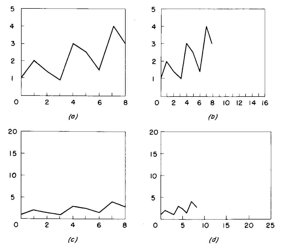
FIG. 2 Graphs having different scales on which identical data have
been plotted.
... paper has blue grid lines, these will not appear in the reproduction, but orange, red, or black lines will show up on a print. The graphs in this Section which have the grid lines showing have been drawn on red-line graph paper.
In order to make good reproductions (by Ozalid, Thermofax, xerography, and other reproduction processes), lines and lettering must be made heavy and dark in order to “stand out” from the grid lines. Ink drawings give the best results, but dark, heavy pencil work will provide legible copies in some reproduction processes. In order to make lettering stand out even more, one can do the lettering on heavy, white paper, then paste the paper on the graph. This has been done with ‘the title in FIG. 5 and in several other graphs in the Section. This is effective, but not necessary, and will not reproduce on blueprints or Ozalid prints. Sometimes the thin grid lines on a graph can be used as guide lines. This has been done with the supporting data (lower right) of FIG. 1. This lettering should be the smallest lettering on the graph. The k-in. height between successive guidelines is ideal.
The tunnel-diode curve of this graph falls in two quadrants, making it necessary to arrange the vertical and horizontal scales so that negative as well as positive values can be plotted. By locating the zero point (origin) to the left of center, it was possible to draw the desired portion of the curve, show the scales and their captions, and provide space in the upper part for the title and in the lower right for the auxiliary or supporting data. The X and Y scale values could have been placed around the edges of the graph, but it is believed that they are more appropriately located close to their respective axes, as shown in FIG. 1.
2. Selection of Variables and Curve Fitting
Data to be plotted graphically are generally available in tabular form, with each point having two coordinates as follows:
POINT | COORDINATES
One set of coordinate values must be plotted on the horizontal, or X axis (or abscissa, as it is often called), and the other set of coordinates must be plotted along the vertical, or Y axis (or ordinate). Standard practice is to plot the independent variable horizontally and the dependent variable vertically. The independent variable is that variable which the operator can control during a test, if one can be controlled. In some cases where a variable cannot be con trolled, one variable is arbitrarily selected. Time, for instance, is generally considered to be the independent variable. A glance at the coordinates, appearing above, shows that the first set of coordinates progresses at even intervals of 10. It is obvious that the operator or observer was able to take readings at 10, 20, etc., either by controlling the variable or, if it were a natural phenomenon such as time, by taking readings at convenient intervals. Those coordinate values in the left column, then, represent the independent variable.
After the graph is laid out and the points are plotted, the problem of drawing, or “fitting,” the final curve presents itself. Whether to draw a smooth curve or straight lines between successive points depends on several factors. Some of them are as follows:
1. Most physical phenomena are “continuous.” This means that the curve showing the relationship between such variables should be smooth—with few inflections—and should pass through or near plotted points.
2. Data backed up by theory should be represented by a smooth curve. (however, if plotted points are not abundant, straight lines are often drawn between points, as with instrument calibration.)
3. Discrete, or discontinuous, data—representing a discontinuous variable having discrete increments — should be shown by joining successive points with straight lines.
4. Observed data not backed by theory or mathematical law should be represented by point-to-point straight lines, unless continuity can be definitely established.
FIG. 1 includes a curve representing continuous data. FIG. 2 has a curve which follows the discontinuous relationship of periodic observations. Figure 1 2-3a shows a theoretical curve and points taken from actual field data. Such points should be joined by a smooth curve. Figure 1 2-3b is a typical example of discontinuous data.
3. Curve Identification
Not infrequently, it is necessary to put more than one curve on a graph. The curves must be drawn or labeled so that they can be easily identified and distinguished from one another. There are three methods by which this can be done:
1. Clearly label each curve
2. Use a different type of line for each curve
3. Use different plotting symbols for each curve
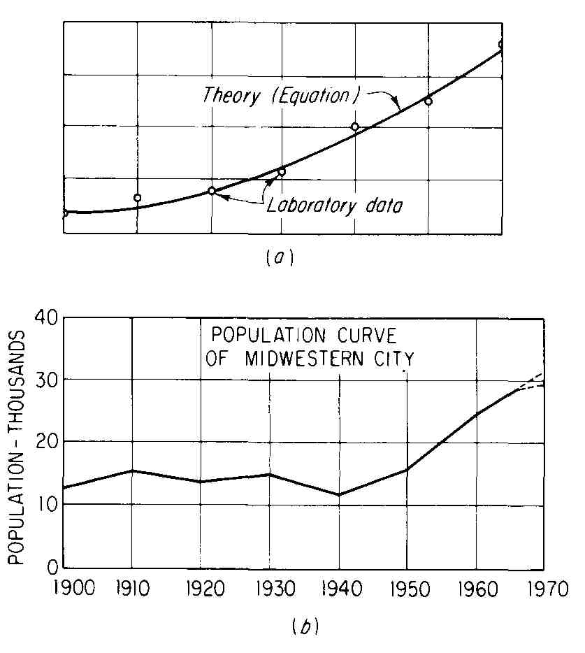
FIG. 3 Examples of curve fitting: (a) a situation in which a curve
should be drawn through or near points plotted from laboratory data;
(b) census figures, taken once every 10 years, which yield discontinuous,
or discrete, data. Straight lines should be drawn from point to point.
RECEIVER “OFF HOOK” TO FIRST PULSE IN SECONDS
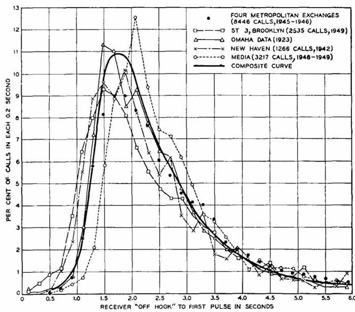
FIG. 4 A composite curve. The heavy curve is a composite of the other
four curves. ( Bell Telephone Laboratories.)
Often two or more of these methods are combined. For example, in FIG. 4 different lines and plotting symbols have been used, except for the composite curve, which is a sort of weighted average of the other curves. A similar identification system has been used in FIG. 5. The difference between the two figures is the method of labeling curves. In FIG. 4, a legend in the upper right corner identifies each line. In FIG. 5, each line is identified by means of a title, or caption, and a leader pointing to the curve itself. Both methods are widely used.
4. Zero-Point Location
In a great majority of cases, line graphs are drawn with the origin at the lower left corner. Figures 2 and 4 are in this category. In other cases, the vertical scale begins at zero, but the horizontal scale does not. FIG. 3b is a good example. Most engineers feel that the Y scale should begin at zero; or conversely stated, they feel that starting the Y scale with a figure not equal to zero tends to distort the picture.
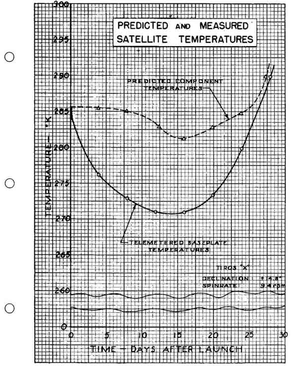
FIG. 5 A graph in which the vertical scale has been “broken” to permit
greater vertical excursion.
Sometimes, however, the values to be plotted on the vertical scale are such that starting the scale at zero will produce a plotted curve that is too flat and inaccurate for working purposes. FIG. 5 is an example of this problem. Note that the temperature plots of the weather satellite fall between 2700 and 2900. By “breaking” the vertical scale between 0 and 2600, we were able to establish ordinate values which provided sufficient vertical latitude (“excursion”) for accuracy and comparison of the two curve shapes. There are other techniques for accomplishing the same result, the point being to warn the reader that the vertical scale is not all there or that it starts at something other than zero.
5. Steps in Construction of an Engineering Graph
The following steps illustrate how a graph, as drawn in many engineering offices, is constructed. Such a graph is shown in FIG. 6.
1. Arrange the data in table form, preferably in a logical order, from the smallest figure to the largest. This will make plotting easier and faster, and will clearly show the upper and lower limits for each variable.
2. Determine which variable will be the independent variable and which the dependent, for the very practical reason that proper coordinate paper must be selected and a decision made whether the long dimension of the paper will be up and down or sideways on the drawing board. These will probably depend on which variable is which.
3. Select the graph paper that will best show the curve and that will accommodate the points to be plotted taking into account their extreme values. This may include a trial plotting of values along the horizontal and vertical axes. In the case of FIG. 6, we selected rectangular coordinate paper having fine lines spaced in. apart, and heavier lines - in. apart.
4. Locate the zero point of each scale (origin of graph), allowing for margins within the grid portion of the paper at the bottom and left side. One-inch margins are common because they allow room for binding the graph at the left side and for scale values and their descriptions.
5. Letter in the values along and outside the two “baselines” provided in step
4. Standard practice is to use multiples of 1, 2, 5, or 10. In FIG. 6, multiples of 10 (each inch representing $10,000) were used on the vertical scale, and multiples of 2 (each half-inch representing 20 kW) were used on the vertical scale. Do not put these numbers too close together.
6. Letter in the descriptions of the scales close to the figures, as shown in Fig. 6 and 7. Vertical lettering should be used, and each description should be centered between the zero point and the figure at the other end of the baseline. Each description should tell what the scale values show, and what units the scale values represent. Typical standard abbreviations are: kW, A, Hz (cycles per second), and kHz (kilocycles per second).
7. Plot the points with a sharp pencil or pricking instrument. It is a good idea to circle these points immediately after plotting so that they will be easily seen when drawing the curve later. If the circles are to be shown permanently, as is so often done with experimental data, they should be hollow and from - to - in. in diameter.
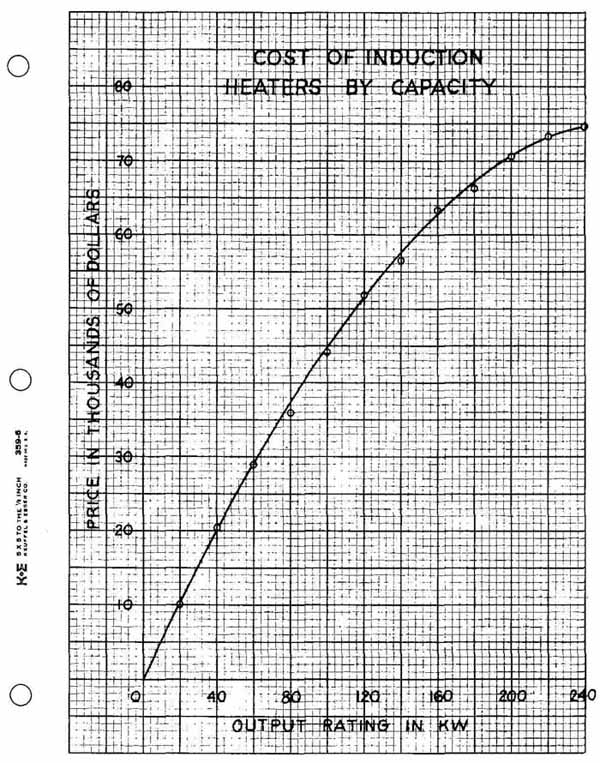
FIG. 6 Another typical engineering graph.
8. Draw in the curve. If the curve is not of the straight-line variety, many persons prefer to sketch it lightly freehand until the desired result is obtained, then to put it in with a heavy pencil line, using an irregular curve. If plotting symbols are used, the curve should not be drawn through the symbols. If a symbol is in the path of the curve, the latter should come up to and just touch each side of the symbol.
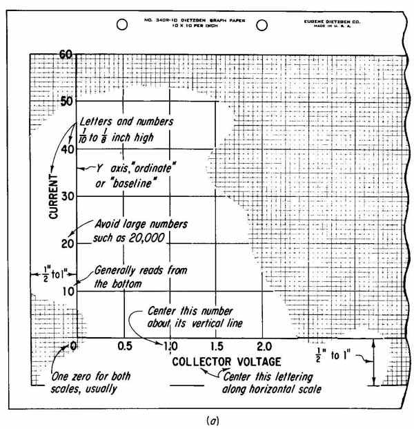
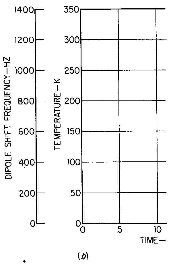
FIG. 7 (a) Layout details for the construction of a graph. (b) When
two or more vertical scales are required.
9. Place the title on the graph. Titles—which are clear, yet as brief as possible — are commonly placed either above or below. This lettering should be vertical uppercase and larger than the numbers and letters describing the vertical and horizontal scales. Some firms require that the fine, preprinted grid lines be erased from around titles and borders drawn around the lettering.
10. Place supporting data, if desired or required, on the graph. Such data may include date of preparation, site of tests or observations, name of person or party making the tests or graph, source of data if not original, equations, and simple circuit diagrams. Such data are often placed in the lower right-hand area of the graph, but are sometimes placed elsewhere if circumstances require. (See Figs. 1 and 5.)
11. Complete the graph. This may include inking curve, borders, and lettering if inking is required. Sometimes letters and figures can be typed on graph paper with standard typewriters or varitypers if special ribbon is used.
A graph should be made interesting and clear through the use of different line weights. The curve should be the heaviest line on the graph, the border(s) or baselines the next heaviest, and grid lines (if not preprinted) the lightest.
6. Drawing a Smooth Curve
Drawing a curve generally involves two steps:
1. Sketching, freehand, a trial curve through (or near, as the case may be) the plotted points
2. Drawing the finished curve along the trial curve, using pencil or pen and a plastic curve or spline
Some of the plastic (often called irregular or French) curves and their usage are shown in FIG. 8. In 99 cases out of 100, it will not be possible to select a plastic curve that will match the plotted curve for its entire length. The next-best solution is to try a curve (if more than one is available) or that part of a curve (if only one is available) that will fit as much of the trial curve as is possible. (If the curve is to be inked later, it is a good idea to remember which parts of the curve were used at different locations along the final curve shape.)
Curve drawing is usually more satisfactory if the pencil is used on the edge of the curve that is away from the person who is drawing. This is somewhat analogous to using the upper (far) edge of a T square or horizontal bar.
7 Scales and Their Titles or Captions
There are good and bad ways to organize the numbers and descriptions along the baselines of a graph. Here are a few examples:
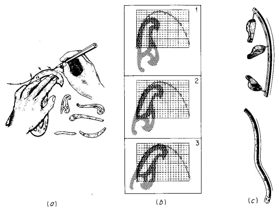
FIG. 8 Irregular curves, splines, and use of the curve. (Parts a and
c from Frank Zozzora, Engineering Drawing, 2d ed., McGraw-Hill Book Company,
New York, 1958; part b from
Thomas E. French, Carl L. Svensen, Jay D. Helsel, Bryan Urbanick, Mechanical Drawing, 9th ed., McGraw-Hill Book Company, New York, 1980.)
8 Families of Curves
FIG. 9 shows a collector-characteristic curve of a transistor which was obtained by varying the voltage and measuring collector current for several values of base current. This family of curves can be used for the determination of transistor performance in a common-emitter circuit and also for the calculation of other useful parameters. For example, it is often desirable to know the ratio of the direct collector current I the direct base input current ‘B This current gain is typically around 49 or 50, calculated as follows:
Other useful characteristics which can be obtained from such a table and other information supplied by a manufacturer are frequency cutoff, breakdown voltage, reach-through voltage, and storage time. When five or more curves are placed on a single graph, it is not very practical to draw a different type of line for each curve. Proper identification of each line is usually accomplished in the manner shown in FIG. 9.
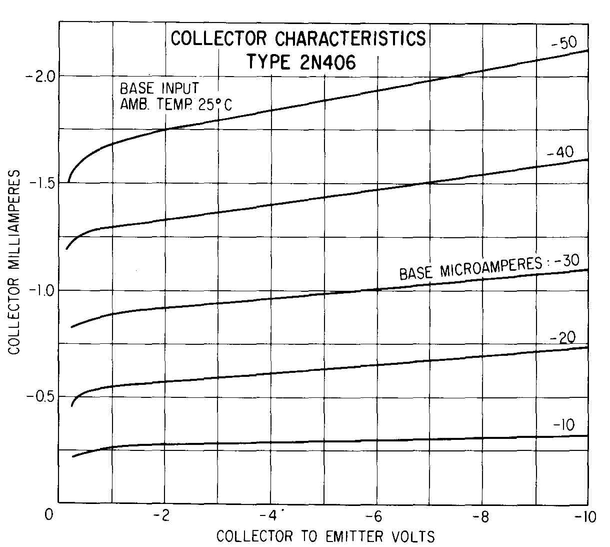
FIG. 9 A family of curves.
9. Graphs for Publication
When graphs are to appear in printed matter, such as books or technical journals, they are usually not drawn on commercial graph paper. ANS Y15.l, “Illustrations for Publication and Projection,” is an appropriate guide for such cases. Covered are such points as minimum letter size and line weights before reduction to legible and clear size. A standard outline proportion of 6* X 9 in. (*: 1) is recommended. No more coordinate lines should be drawn than are necessary to guide the eye. Because additional discussion is presupposed, sup porting data and equations should be omitted. In the majority of published graphs, plotting symbols are not shown, although some do include these symbols. Figures 9, 14, and 17 are good examples of this type of graphical presentation.
In short, the published graph is a rather simple construction, uncluttered by minute data, yet very clear and legible. In order to have clarity and legibility, it might not include all data necessary to tell the whole story.
10. Line Graphs on Other Types of Graph Paper
As mentioned previously in this Section, other kinds of commercially printed graph paper are available and used by many engineers and scientists for various reasons.
FIG. 10 shows curves for cassette tapes over a range of frequencies from 30 to 12000 Hz. Like many curves in which frequency is one of the variables, it is plotted on semi-logarithmic paper, in this case on a four-cycle paper. It would be impossible to plot points accurately over such a large range on linear (rectangular-coordinate or square-grid) paper. With the use of semi- logarithmic paper with three, four, or five cycles, it is possible to plot accurately. When using such graph paper we do not convert the raw data to logarithms.
Another reason for using different kinds of graph paper is to achieve a pattern that yields a “straight-line curve.” Sometimes, points that yield a curved pattern on one kind of paper yield a straight-line pattern on another kind of paper. The following will result if a straight-line curve can be drawn:
1. Future prediction (extrapolation) is easier if a straight line is used.
2. Two curves can be better compared if they are straight-line curves than if they are otherwise shaped.
3. The slope and equation of the line (and therefore of the data which produced the line) can be obtained graphically.
If the logarithmic scale is oriented vertically and the linear scale horizon tally, a curve representing a constant rate of change will plot as a straight line. Such a curve would result if we were to plot the 2.8 percent annual increase in the rate of change of our output per worker-hour since World War II.
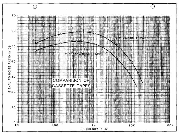
FIG. 10 Comparison of two cassette tapes. Plotted on four-cycle semilogarithmic
paper.
11. The Logarithmic Scale
The logarithmic scale is a functional scale in which the distances are laid out to equal the function (logarithm), but the numbers at these distances are those of the variable. A logarithmic scale from 1 to 10 is called a cycle. The left edge of the scale is marked 1 (the logarithm of 1 is zero), and the right edge 10 (the logarithm of 10 is 1), and we have a unit scale from the log of 1 (zero) to the log of 10 (1). This unit scale is called a cycle, but we can scale intermediate distances like 1.5, 2, 3, 5, etc., and show those numbers at those points. A logarithmic scale from 10 to 100 or 100 to 1000, etc., is also called a cycle, or modulus.
It is impossible to have a zero showing on a logarithmic scale. If the scale includes the number 1 at either end, the zero is there graphically because the logarithm of 1 is zero. Also, the logarithm of zero is minus infinity. This would be impossible to plot graphically.
It is also worth noting that interpolation between marks on a logarithmic scale must be done logarithmically. When using logarithmic graph paper, one does not have to be concerned about this.
12 Equations of Straight-Line Plots
The following equations will apply in the situations indicated:
EQUATION | TYPE OF COORDINATE
y mx + b
Rectangular
mx± b
Rectangular ( values plotted against x values)
y = bx’”
Logarithmic
y = b (10)”’ or
Semilogarithmic (logarithmic scale vertical)
y = b (e)
y = m log x + b
Semilogarithmic (logarithmic scale horizontal)
In these equations, m represents the slope, and b the intercept. We will show how to get these quantities in the next two examples.
13. Use of Logarithmic Paper
Logarithmic paper (both scales are arranged logarithmically) is used for reasons similar to semilogarithmic paper. If the range of plotted values is large in both the x and y directions, logarithmic paper, with the proper number of cycles, can be used very much as semilogarithmic paper was used to accommodate the large range of frequency values used in FIG. 10. As in the case of semilogarithmic graph paper, logarithmic paper is available with anywhere from one to five logarithmic cycles, and anything in between. The most-used papers have the same number of cycles in the horizontal and vertical directions, but papers are available with different combinations. Usually, however, the length of one horizontal cycle is the same as the length of one vertical cycle.
Another reason for plotting data on logarithmic paper is to get a straight- line pattern. It might be found by trial and error that a certain group of data provides a straight-line plot on such paper. Or theory or previous tests with similar data may indicate that a set of plotted points will yield a straight-line pattern. FIG. 11 contains such a situation. Plotting of points and construction of the graph follow the same techniques, previously explained, for drawing a graph on rectangular coordinate paper. One difference is that the numbers around the edge are usually already printed on the sheet. The drafter often must add zeroes or decimal points to the numbers of the scale.’ Because these numbers are outside the grid, the scale caption must also be placed outside the grid. Another difference is that the curve itself should not be very thick, if one wants to obtain accuracy in measuring the slope and locating the intercept.
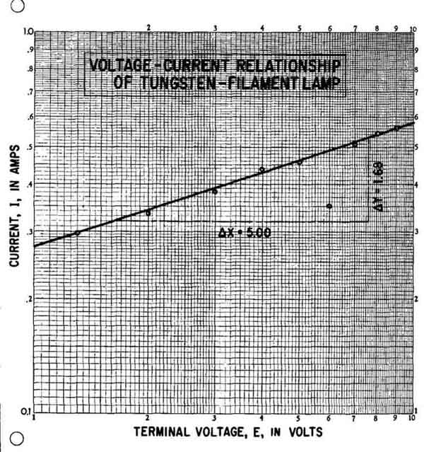
FIG. 11 Data plotted on logarithmic paper. These data yield a straight-line
pattern (E represents the slope).
In FIG. 11, a right triangle with a 5-in, base has been drawn. Each leg of the triangle has been measured accurately with a decimal scale to obtain L and y values. (This is construction work, and it is sometimes erased and does not appear on the finished graph.) The important point about measuring the legs of the triangle on logarithmic paper (where the horizontal and vertical cycles are equal in length —which is usually the case) is that a linear scale be used and that the same scale be used to measure each leg. Instead of using a decimal scale, we could have used a 50 scale, 40 scale, quarter scale—or any linear scale. Using the logarithmic scale of the graph paper to measure the legs will not provide the correct slope. The slope is obtained as follows:
m = AV = = 0.336 or 0.34
The intercept is found by observing where the line intersects the Y scale where x = 1 (remember, the log of 1 is zero) and reading the value along the Y scale. The intercept in FIG. 11 is:
b = 0.272
The equation for this line is, therefore,
y = 0.27 2x°
or, using the abbreviations for the actual units plotted,
I = 0.27E°
The third-decimal-place values have been dropped because there probably is not enough justification for this type of accuracy. Two-decimal accuracy is appropriate, however.
14 Use of Semilogarithmic Paper
FIG. 12 illustrates a situation in which a series of plotted points provides a straight-line pattern, as shown by the line. As in the case of the logarithmic graph, previously cited, the scales had to be marked off around the outside edges of the grid because the log scale numbers had already been printed.
=== ==
1.Sometimes the printer does not leave enough room for this, or there is not much room for scale titles, presenting a rather awkward situation.
2. If the horizontal and vertical cycles of the paper are not equal in length, one will have to select
points on the line and work with their coordinates to get the slope:
m = (log Ay — log By)/(log Ax — log Bx).
=== ==
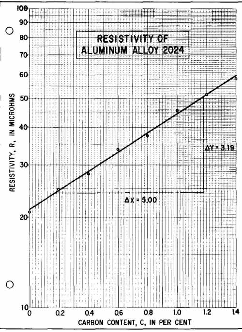
FIG. 12 Points that give a straight-line pattern when plotted on semilogarithmic
paper.
The delta y and delta x values shown were measured with the same linear scale. But because the two scales of a semilogarithmic graph are different, we have to do a little more work to get the correct slope. The additional work (beyond what was done in the case of the logarithmic graph) is to obtain values of unity for the X and Y scales. Unity for the X scale is 5.00 in. (the actual distance from x = 0 to x = 1.0). Unity for the Y scale is 10.00 in. (the distance from log 10 1 to log 100 = 2), in this case the length of the logarithmic cycle from 10 to 100. Now, we are ready to determine the slope.
m = . X measured with the same linear scale
y unity length/x unity length
in = = 0.319 or 0.32
The intercept is found by reading the value along the Y scale where the line intersects at x = 0:
b=21.3
The equation is
y=2i.3(10)^0.32c.
or R = 21.3 (10)^0.32c’
If it is preferred to use e instead of 10 in the equation, the slope must be divided by 0.434, which is log 0.32
m = 0.434 = 0.74
and the equation becomes
R = 21.3 (e)o
If one cannot reconcile the graphical method just explained, one can check the slope by selecting two points on the curve and using their coordinates as follows:
m = log A; — log By
Ax — Bx
We have done this by selecting points at A = (1.16, 50) and B = (0.46,30) to get
1.699 — 1.476
116—046 =0.319 or 0.32
There are other methods which can be used to obtain, or check, these equations. One method which requires more work but which is more accurate—and which can utilize a digital computer — is the method of least squares.
15 Polar Coordinates
Because of the directional characteristics of electrical devices such as lamps, antennas, and speakers, studies must be made of their performance in different directions. The results of these studies can be most appropriately shown on polar charts. These show two variables, one having a linear magnitude plotted on equally spaced concentric circles, and the other an angular quantity plotted radially with respect to a pole or origin. The plotted points are usually, but not always, joined to form a line or curve.
FIG. 13 shows a polar plot of the power-radiation pattern of a half wave dipole, as computed by an analog computer. Notice that the linear scale is shown as units based on 1.0 being the maximum. Notice, also, that the zero is at the bottom of the graph. The curve has two large enclosures, called lobes, and points of zero magnitude, called null points, at 90 and 270°.
FIG. 14 depicts the cross-talk coupling between two antennas at the same location. The two “envelopes” show the maximum cross-talk obtained for two positions of the transmitting antenna when the receiving antenna is rotated clockwise. Notice that zero is at the top and that degrees increase both clockwise and counterclockwise from zero.
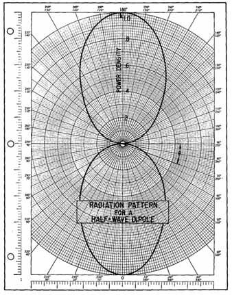
FIG. 13 A radiation pattern plotted on polar coordinate paper. (Zero
at bottom.)
ANGLE IN DEGREES
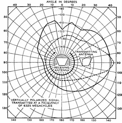
FIG. 14 Another graph on polar coordinates. (Zero at top.)
In other situations, it is sometimes desirable to plot zero at the right side of the graph and go counterclockwise, much as the mathematician plots values of trigonometric functions. It is possible to buy polar coordinate paper that has the zero at the top or at the bottom. Disk recording devices use polar charting, and, instead of radial graduations being in degrees, they are in hours or days.
16 Bar Charts
Some types of data do not lend themselves well to presentation in line graphs. They might be better suited for display in some other form, such as a bar chart. Also, data in graphical form must often be presented to clients or persons who do not have technical backgrounds. Such persons may find bar graphs, pie charts, and pictorial graphs easier to read.
FIG. 15 A bar chart or graph. (Titles for bars are often placed below the bars.)
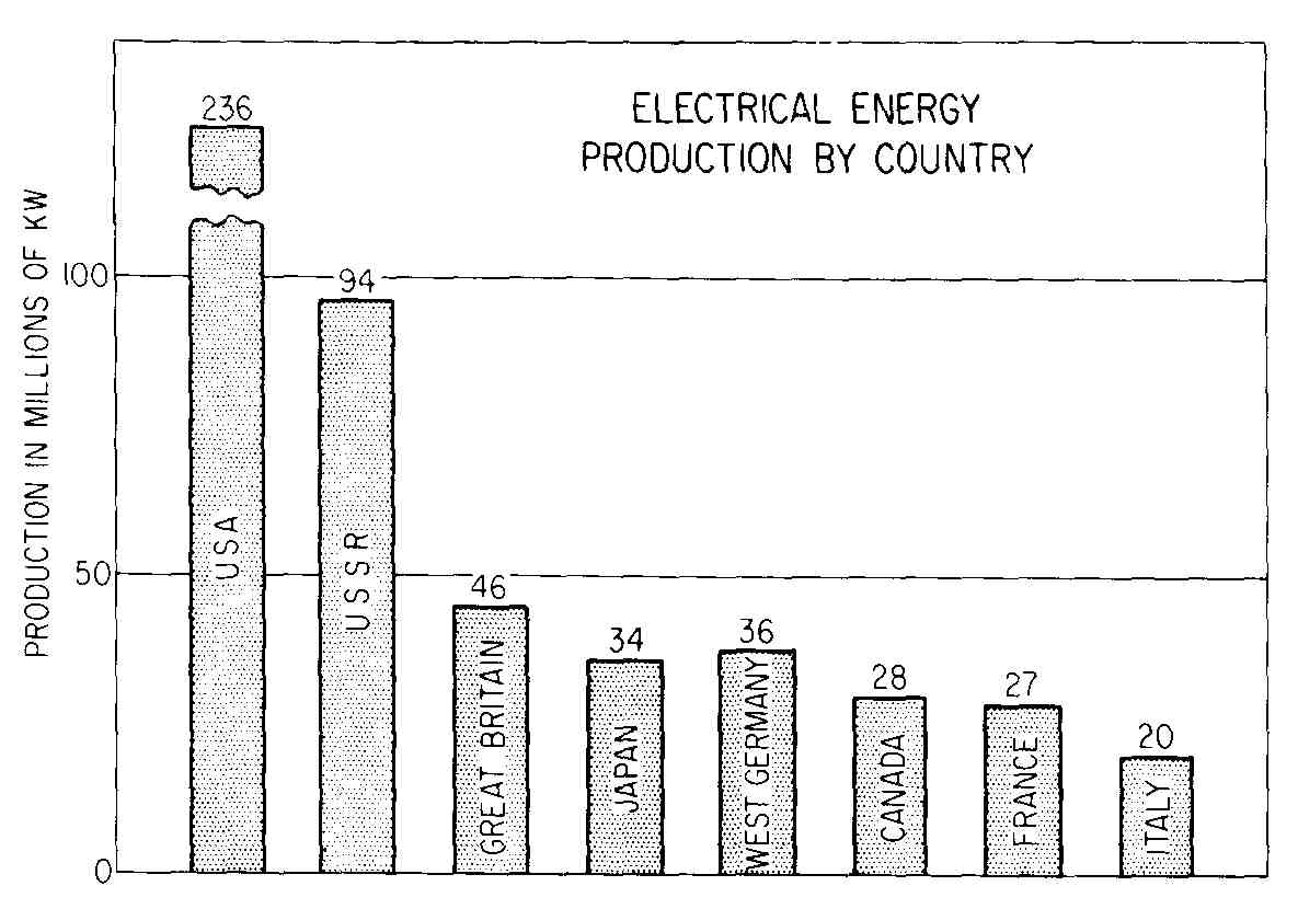
FIG. 15 is a bar chart in which the bars run up and down, for which
reason it may also be called a column chart. Its construction is arrived
at in much the same manner as a line graph that is plotted on rectangular
coordinate paper. General practice is as follows:
1. Several major horizontal grid lines should appear with their scale values.
2. Bars, or columns, should be shaded.
3. Widths between bars should be no wider than the bars themselves and may be less.
4. Bars are often arranged in ascending or descending order, but this is not a requirement.
To make an attractive bar chart, one should consider using preprinted appliqués for shading. Rather than make a scale which would accommodate the United States production of 236,000,000 kW, the authors decided to use a scale that would permit the bars of the other countries to be larger and “broke” the United States bar as shown. While not generally done, this is acceptable practice as long as the values are shown at the top of the bars.
Another type of bar chart is shown in FIG. 16. This is only one form of a horizontal bar graph. Another form has a zero line running up the middle, with bars representing positive values extending to the right and bars with negative values to the left. Bars may also be broken down individually into several parts. For example, if the information were available, we could show what percent of each country’s electrical production was (1) hydro, (2) steam generating, and (3) nuclear, on the graph of FIG. 15.
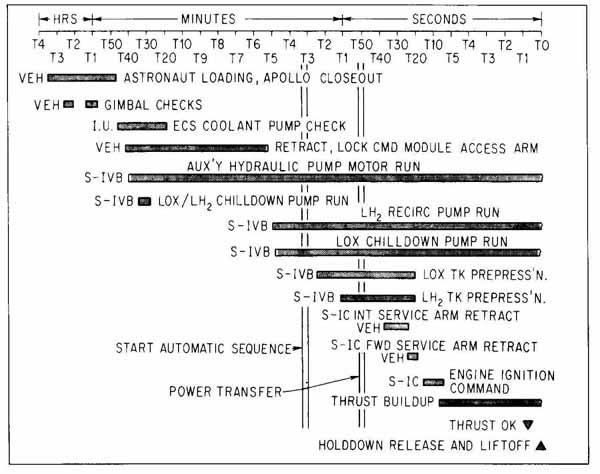
FIG. 16 Horizontal-bar chart showing typical prelaunch events for Saturn-Apollo
space flight. (NASA.)
17 Pie Graph
A very popular type of chart, although held in low regard by statisticians, is the pie chart. It is most effective for displaying five to seven items that make up 100 percent. A well-designed pie graph has the largest item in the upper right sector, starting at 12 o’clock, followed by the next largest item, and so on in a sequence of decreasing size. The following principles of good construction apply:
1. The graph must be large enough to permit lettering within all but the very smallest sectors.
2. Arrangement of items should follow a sequence of decreasing sizes ( FIG. 17).
3. Items should have a shading sequence of ever-increasing or -decreasing darkness.
4. The largest item should start at 12 o’clock and be on the “clockwise” side.
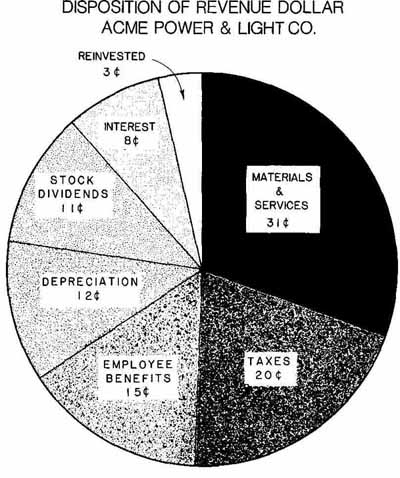
FIG. 17 A pie graph. Notice that the material is arranged sequentially
by size.
5. A title should be placed above or below the graph.
6. The percentage or value should show in each sector.
18 Pictorial Graphs
There is some evidence that graphs presented in pictorial form are remembered longer than those drawn in two dimensions. Many different ways of showing graphs in pictorial form have been used, including isometric, dimetric, oblique, and perspective construction. A three-variable pictorial graph has been shown in FIG. 18, which has been drawn in isometric projection. Making a graph like this takes quite a bit of time; for one thing, lettering is a little tricky. Therefore, one should be sure that the results will justify the extra effort. The material presented in FIG. 18 could have been presented in the form of the graph shown in FIG. 9, and vice versa.
Another pictorial drawing, shown in FIG. 19, is only partly a graph. This shows how ingenuity can be used to combine two different kinds of graphical representation. Other forms of pictorial representation of graphs have been used with success. Bar graphs have often been drawn pictorially. Oblique projection adds depth to the bars and makes possible the addition of more information in the third dimension.
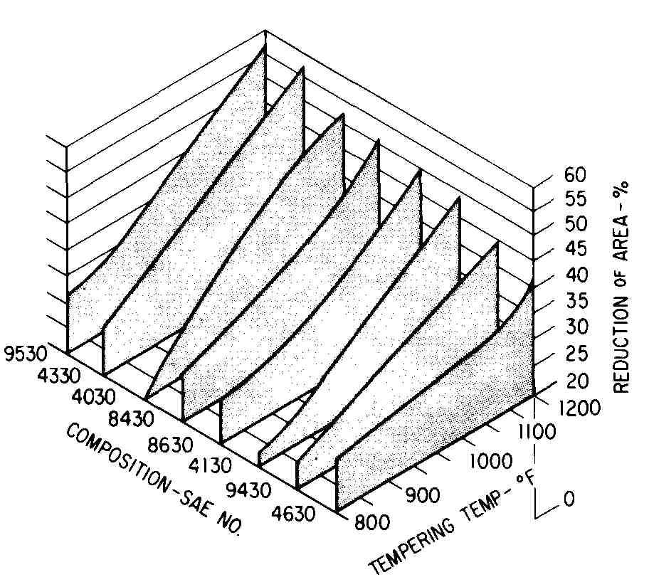
FIG. 18 A pictorial graph showing reduction of area of various steels
after liquid quenching at various temperatures. (Three variables in isometric
projection.)
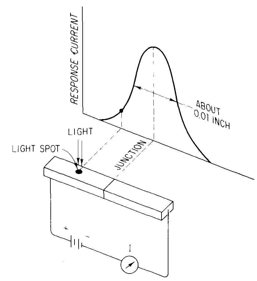
FIG. 19 A pictorial drawing (in dimetric projection) showing the response
of a photodiode depending on where it is illuminated. The curve is a
normal frequency distribution curve.
19 Other Types of Graphic Presentation
The graphs shown in this Section are of the type found most often (perhaps 95 percent of the time) in engineering, design, and research offices. Actually, there are a number of other ways to present material graphically, and some of these graphical forms can be used for calculation as well. Some of these graphs have been assigned names as follows:
1. Alignment charts
2. Concurrency charts
3. Conversion scales
4. Network diagrams
5. Holographs
6. Derivative curve [graphical calculus]
7. Integration [graphical calculus]
FIG. 20 is a type of conversion scale that shows the comparative economic advantages of reducing the weights of various electrical or electronics gear. For the other types of graph, listed on the preceding page, the reader should refer to a good text on engineering graphics, graphics, or graphic science.

FIG. 20 A line diagram, which is also a conversion diagram. This shows
justifiable cost for removing by miniaturization one pound or gram of
unnecessary weight. (From Edward Keonjian, Microelectronics, McGraw-Hill
Book Company, New York, 1963. Used by permission.)
SUMMARY
Graphical construction is a very important phase of technical drawing. A careful survey of the problem is the first and most important step in successful graphic presentation. It should cover a careful consideration of items such as the following:
1. The purpose of the graph
2. The occasion for its use
3. The type of person who is to read it
4. The nature of the data
5. The medium of presentation to be used
6. The reproduction process to be used
7. The time available for preparation
8. Equipment and skill available
A graph should have a sufficiently professional appearance to inspire confidence in the facts presented. Layout and design are as important as quality of drafting. The type of data being portrayed graphically determines whether the curve should be smooth or a series of straight lines from point to point. Clarity and brevity are the two most important features of any graph. Some graphs can be used for purposes of computation. For example, equations such as y = mx + bandy = bxm can be obtained if the curves appear as straight lines on the appropriate types of graph paper. Alignment charts, concurrency charts, and other graphical forms are useful in making certain computations.
QUESTIONS
1. What determines whether the plotted points on a graph should be connected with straight lines or be joined by a smooth curve?
2. What are two reasons why it is sometimes desirable to have data plotted in one straight line (by using different graph paper) instead of as a curve?
3. What determines whether data should be shown by means of a bar (or column) chart or by a pie chart?
4. Name four types of commercial graph paper that are available.
5. Along which axis is the dependent variable usually plotted?
6. In plotting the data from a laboratory experiment, how would you go about determining which variable is the independent one?
7. If it were necessary to draw two curves on one graph, how would you differentiate between these curves?
8. In what way would a graph that is made for a slide projector differ from a graph that is made to be part of an engineering report?
9. Name three purposes for which graphs are or may be used.
10. What are three different line spacings that may be purchased in commercial rectangular coordinate paper?
11. Why is there not a zero point on logarithmic graph paper?
12. What do we mean by a “cycle,” as it pertains to commercial graph paper?
13. List three examples of supporting data that might appear on an engineering graph.
14. When using commercial graph paper, where would you place the title? The supporting data?
15. If three different weights of lines are to be used in drawing a graph, which parts of the graph will be depicted by which weights of line?
16. Name four shapes of plotting symbols that are commonly used in graph work. Which symbol is the most common?
17. In what numbers, or multiples thereof, do we usually lay out the baselines of a graph?
18. List four abbreviations that are often used to indicate typical units that are placed along a baseline.
19. If it is desired to show each point permanently by means of a circular plotting symbol, how large would you make the symbol?
20. What characteristic of a heater or antenna can best be shown by means of a polar graph?
21. In constructing a pie chart, what two sequences should be observed and followed?
22. What would be a reason for using graph paper with blue lines, as opposed to using red-line paper?
23. List two sequences of numbers placed along the axis of a rectangular coordinate graph that are considered to be poor sequences.
24. Why is it possible to draw a right triangle on a straight-line curve on logarithmic paper and use the linear lengths of the two legs to obtain the correct slope?
25. What are six factors that should be considered in the layout of a graph?
PROBLEMS
1. Prepare a pie chart for the 1990 forecast of the market for fiberoptic sensors. Follow the suggested arrangement of data given in Sec. 12-17. Use 8- 11 paper.
TABLE A
Commercial $120 Million
Military 92
Aerospace 68
Medical 45
Utility 35
2. Prepare a bar or pie chart for the increase in capacity (in megawatts) estimated by the Public Service Company (Table B).
3. Plot the hourly demand and normal-capability curves of the interconnected system of Mid-Western Power & Light Co. (Table C).
TABLE C
4. The 10-year history of generation data of East States Utilities Company is shown in Table D. Plot the kWh and Btu curves on one graph.
TABLE D
5. Make a bar chart of the data presented in Prob. 3.
6. Make a bar chart of the data presented in Prob. 4.
7. The following data (Table E) show the survival probability of a non-redundant system and a redundant system with N = 1 0 components. Plot both curves and identify each. Failure rate is f= l0 per hour.
TABLE E
8. The following data (Table F) include the capacitance per unit area and the breakdown voltages of Si0 silicon structures in microcircuits for different oxide thicknesses. Plot the two curves on the same graph, identify the curves, and provide a suitable title.
GRAPHICAL REPRESENTATION OF DATA 471
TABLE F
9. Plot the family of curves for the 2N 1490 NPN transistor having a base input on a common-emitter circuit. Curves for four base currents are shown below (Table G).
TABLE G Collector Characteristics
10. Table H provides data for four characteristic curves of a 2N2 102 NPN transistor for an ambient temperature of25° C. Plot the family of four curves for a common-emitter circuit having a base input. These are typical collector characteristics.
TABLE H
11. On rectangular coordinate paper, plot the depreciation-cost curve and the maintenance-cost curve for electronic heating equipment, using the data given below (Table I). A suitable title would be “Costs of 60-Hz Electric Energy.” Use different plotting symbols for each curve. Your instructor may want you to add the two curves graphically to get a total cost curve.
TABLE I
12. Table J contains data on TM 999 board projects that have been subjected to reliability testing at 65 C.
TABLE J
A dynamic burn-in (to be plotted at the left of zero) significantly reduces failures. Plot the cumulative failures versus board operating time. The curve is straight between 12,000 and 20,000 h.
13. The annual requirements for artwork for three types of circuit manufacturing have been rising and will continue to do so. The data shown below (Table K) should be plotted on rectangular (arithmetic) graph paper to show past and estimated requirements through 1992.
TABLE K Number of Artwork Layouts per
14. On semilogarithmic paper (three cycles) make a graph for the data given below (Table L). An appropriate title might be “Input Resistance versus Load Resistance of Transistor Circuit.”
TABLE L
15. Construct a graph, using multicycle semilogarithmic paper, for the phase response of an RC amplifier. Let the phase shift, below, be the dependent variable (Table M).
TABLE M
16. Make a graph showing the two curves, one with and one without feedback, for the frequency response of the operational amplifier (Table N).
TABLE N
17. On polar coordinate paper, plot the dipole radiation pattern using the data listed in Table 0. There will be a major and two minor lobes. Do not number or circle points. This is a vertical plane pattern of a half-wave center-fed antenna. (Zero should be at bottom of chart.)
TABLE O
18. The data listed in Table P provide a vertical plane radiation pattern for a *-wave antenna. The 0-to-180° line represents the axis of the antenna. Make a polar plot, using an irregular (French) curve wherever possible. (It may be necessary to round off the tips of the lobes by careful freehand drawing.) Do not number points or put plotting symbols around them. (You may put 00 at the left side of the graph if you wish.)
TABLE P
The following graphical plots are of such a nature that each one yields a straight-line pattern if plotted on a certain type of graph paper. If the straight- line pattern can be achieved, then the student can write the equation for the line (and the data), using one of the equations listed in Sec. 12-12. Some experimentation of a trial-and-error nature will be required, in most cases, before the student will be able to draw the graph on the correct paper. Principles of graphical presentation should be followed, and the final graph should have a title and good line work and lettering, and the equation (if required by the instructor) should be shown prominently on the graph.
19. The following data (Table Q) provide a single-family transfer characteristic of a transistor, which is part of an integrated circuit on a silicon wafer. (The intercept quantity will be negative.)
TABLE 0
20. The following data (Table R) are from test records on 2409 integrated circuits. There are two curves, one for 90 and one for 95 percent upper-confidence limits. Units are hours and failures per hour.
TABLE R
21. The following data (Table S) show the optimum frequency of different skin thickness of brass andiron. Plot frequency in megahertz. (Them quantities will be negative.)
TABLE S
22. The following data (Table T) show the relationship of power loss to the armature voltage of a 1/4-hp electric motor.
TABLE T
23. Table U provides data that show the resistance in ground connections according to how deep the grounding rod is placed in the soil.
TABLE U
24. The United States semiconductor industry has maintained a constant increase in productivity (Table V). Use 1950 for the y intercept.
TABLE V
25. Failure to align the length standard when making linear measurements with a laser causes a cosine error which plots as follows (Table W):
TABLE W
MISALIGNMENT ANGLE X (MINUTES)
COSINE ERROR e (PPM)
26. The manufacturing tolerances of thin-film resistors, according to the present state of the art, are (Table X):
GRAPHICAL REPRESENTATION OF DATA 479
TABLE X
RESISTANCE VALUE
MANUFACTURING TOLERANCE (PERCENT)
27. The luminous intensity of an LED varies with the air temperature (Table Y). Use 0CC for the y intercept.
TABLE V
LUMINOUS INTENSITY (LUMENS)
AIR TEMPERATURE (°C)