UNFORTUNATELY, individual tastes in decor are far less predictable than the functional performance of electronic parts.
There is, therefore, no simple set of rules that will enable you always to produce a completely charming installation. Nevertheless if you will absorb what follows you will be able to do better than average, and you embarrassing and costly errors.
Several factors make up the visual appeal (or lack of it) in a given object. Some have to do with the design or style of the thing itself as a single entity, while others concern its relationship to its surroundings. This section is concerned with the first category while the next section deals with the second.
Keep in mind as we discuss design and style of installation housings that they can, in fact, exist only in relation to some sort of surroundings, and therefore should never be considered as ends in themselves.
But what are the specific factors within an individual object that tend to make it pleasant or unpleasant to the eye? Although we are referring primarily to cabinets or built-in constructions in tended to house hi-fi equipment or speakers, the same factors apply to many other objects.
One such group we shall consider under the general heading of design; the other as elements of style. Design is the broader of the two terms, encompassing elements basic to the development of all styles. The elements of design are line, shape, form, proportion, color and texture. These are the raw materials from which styles are formulated. Style results when they are used to create distinctive combinations of form, proportion and decorative detail that are accepted as beautiful and useful by the society for which they were created.
Beautiful and useful. We know fairly well what "useful" means.
But what is "beautiful"? The greatest artists and philosophers have pondered that one, and the fact that their conclusions have varied so widely convinces us that you and we are not likely to get much closer to the cosmic verity than they did. The fellow who said that "beauty lies in the eye of the beholder" got pretty close, except that we'd go a couple of inches further and say that beauty is also in the mind of the beholder. This is the only simple and logical explanation for the fact that a number of historical styles, in concept quite at variance with each other, remain popular in this country at the present time.
Two other key factors that have repeatedly and profoundly influenced the development of styles throughout history are the materials and technologies available at different times and places.
While the scope of the present volume does not permit a discussion of the many fascinating and curious effects of these influences, they are mentioned in passing to explain a number of seeming oddities that you may encounter. One of these is the Early American Colonial style discussed later in this section.
Design, then, provides the basic elements from which styles are made, and a style in turn expresses the concept of the beautiful held by a particular group of people at a particular time. In any individual, this personal concept of beauty is what the esthetic appeal of an object touches, if it touches anything.
Merely because a particular style of design fails to excite you does not condemn it for someone else, and vice versa. Hence, it is necessary for you to be knowledgeable enough to understand another person's taste, even though you may heartily disagree with it.
Elements of design
Probably if you had a nickel for every time you've been exposed to ads trilling about the "sweeping lines" or "flowing contours" of some thunderingly ordinary product, you would be able to retire instantly and live in comfort, nay luxury, for the rest of your days.
For all of the times you've run into the word "line" used in this connection, you may never have come across its meaning to an artist. In design, line is the basic element from which the more complex constructions, shape and form developed and on which they are based. Line is a man-made abstraction. It practically does not exist in nature. As you look across the room, there is no line where that chair ends and the wall behind it begins. The chair just ends, and your subjective visual perception supplies the line.
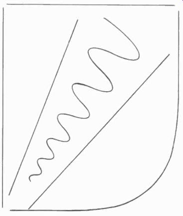
Fig. 1001. There are only two types of lines; straight and curved.
Lines, like words, are abstractions that can be used when referring to and thinking about things. As such, they are one of the primary tools used by the designer.
The ad man's product has form, proportion, color and texture, but it hasn't had any lines since it left the drawing board. The reason for emphasizing what may seem a semantic distinction is that so often a design may appear beautiful on paper and grisly when built, because the other factors just mentioned were not adequately considered.
Lines
There are only two kinds of lines; straight and curved (Fig. 1001) . You'll qualify for a solid gold Cadillac and a lifetime supply of pickled kumquats if you can think of a third. And don't try to ring in broken lines, since they are merely groupings of straight or curved lines.
Horizontals and verticals are called static lines, while any diagonal in between is called dynamic (Fig. 1002). To the designer, there is an important distinction here that is not so vital to the layman. The static line is at rest visually. The dynamic line isn't, and requires visual balancing to avoid an unpleasant effect. In the design of hi-fi housings, and furniture in general for that matter, dynamic lines are not common, so don't worry about them.
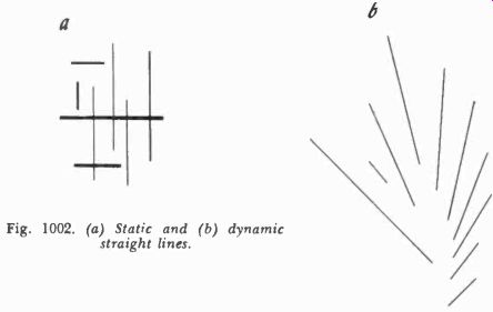
Fig. 1002. (a) Static and (6) dynamic straight lines.
Curved lines, too (Fig. 1003), are divided into two classes. One is the class of regular curves. This includes the circle, the oval, the spiral, and regularly repeated types, such as a wave or scallop. All other curves fall in the remaining category of irregular or "free form" curves.
Since most hi-fi cabinets are made of wood, and wood comes in straight panels, planks and timbers, the judicious use of curves in the design can help greatly to reduce the linear monotony inherent in the material itself. But these curves must be introduced in a way that conforms to the nature of the material. To curve the main panels of a cabinet is extremely difficult. But curving the edges of such a panel is comparatively simple.
Shape
Lines are used in various combinations to develop shapes, as may be seen in Fig. 1004. Shapes or planes can be regular or irregular, depending on the lines of which they are composed. A few lines such as the circle, the oval and some free-form curves (Fig. 1005) are both lines and shapes at the same time, since they return on themselves and thus delineate a complete area and separate it from its surroundings.
The shape that will concern you most is the rectangle, since it is Fig. 1003. Various types of regular and irregular curved lines.
combinations of this one that result in the three-dimensional forms of most cabinets. The circle, the oval, the diamond and many other shapes appear in the decorative detailing of various styles of design, and as such they are usually among the identifying characteristics of specific styles.
Form
Form, then, results from the combining of shapes into three dimensional objects. The commonest, although not by any means the only form for hi-fi cabinets is rectangular, as shown in Fig. 1006. The corner speaker (Fig. 1007) is certainly not a rare departure from this form, and there are many others possible.
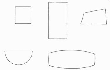
Fig. 1004. Shapes are plane areas fully enclosed by lines.
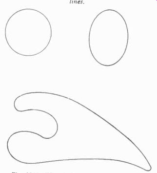
Fig. 1005. The circle, the oval and some free-form curves are both
lines and shapes simultaneously.
For hi-fi purposes, the form a cabinet will take is dictated partly by the conventions of the particular style to which you wish to conform and partially by the requirements of the equipment that is to go inside. To mount equipment so that it can be conveniently operated in period style cabinets, it is often necessary to waste some inside space. After all, Sheraton didn't know hi-fi was coming, so he could hardly plan for it.
If you must change the height, width or depth of a cabinet relative to the other dimensions, you will inevitably change the form. Minor changes of an inch or so are not likely to cause trouble, but if you need to make a change of half a foot, be very careful. You might end up with a form that is not at all good for the style you are using. In general, the more folksy styles like Early Colonial or Provincial will put up with more pulling and hauling than the sophisticated, formal styles, such as Hepplewhite or Sheraton. And with Modern, you can be pretty free.
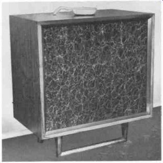
Fig. 1006. Rectangular form for speaker en closure. (Design by Jeff
Markell.)
Proportion
Questions of proportion deal with relationships sometimes within a form, and other times between forms. Within a form (Fig. 1008), proportion refers to the relationship of height to width, to depth, and to the heights and widths of doors, drawers or drop fronts relative to each other and to the overall piece.
Between two or more forms, proportion still relates to heights, widths and depths relative to each other, but these relationships properly fall in the province of the next section and will be discussed there.
Within a single form, an infinite variety of proportional relationships are possible, but, in cabinet and furniture work, experience has shown a range in which the most generally satisfactory ones will fall. Let's look at a few examples and you'll begin to see what we mean.
At one end of the scale, the simplest proportion of width to height to depth for a cabinet is 1:1:1 or a cube (see Fig. 1009-a).
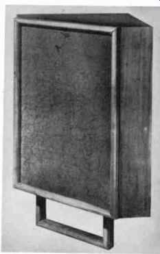
Fig. 1007. A corner speaker enclosure of non-rectangular design. (De
sign by Jeff Markell.)
No matter what you do, this is an uninteresting and ugly proportion. There is no contrast. Remember all the table-model TV sets of a few years ago that were practically cubes? That's one reason they were so ugly. Fig. 1009-b shows a 2:1:1 ratio. This is a considerable improvement, but you can't go too far in varying just one dimension as in Fig. 1009-c. This shows 3:1:1 which is getting disproportionately long. Fig. 1009-d (3:2:1) is getting better, and Fig. 1009-e (3:2:1 1/2) is the best yet.
Now, what does all this indicate? Unfortunately, we know of no simple set of rules that will apply to all cases, but the following will apply to a goodly number:
1. Preferably, no two dimensions should be the same (let alone three).
2. The largest dimension should be at least double the smallest.
3. The largest dimension should not be more than double the middle one.
4. The difference between dimensions should increase as the dimensions increase (3:2:1 is not as good as 3:2:1 1/2).
The proportioning of cabinet fronts (doors, drawers, etc.) is dictated by the equipment to be housed. One hint: if the inside spaces are going to be very irregular (Fig. 1010), don't let them show through on the front. Put on a pair of matching doors to hide the whole thing, and let it go at that.
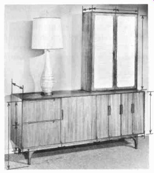
Fig. 1008. Some of the proportional relation ships that exist in a
cabinet. (Raynes and Rhine, Inc.)
Color
In a built-in installation where the housings are to be painted to match the wall, there is no color problem other than the accurate mixing of the paint. A competent painter can do this.
With free-standing furniture, the color must be appropriate to the style. Check the colors that were used for the style you are working with, and stick closely to them. A trained designer or decorator can successfully make departures from these colors, but your chances aren't too good, so why risk an embarrassing failure? You are not likely to have much to do with color determination anyway. The other furniture in the room has probably dictated both the style and color to be used. Your problem is more likely to be one of getting a finisher to match the color of the other furniture correctly. Don't make him guess! Get a door or a drawer from one of the pieces to be matched. Madam won't like this much, but generally she'll go along with it if you explain that this is the only way you can guarantee a sufficiently accurate match for her to be happy with the end result.
Design expressed in style
Variations in form, proportion, color and decorative detail sup ply the primary distinctions between the various furniture styles.
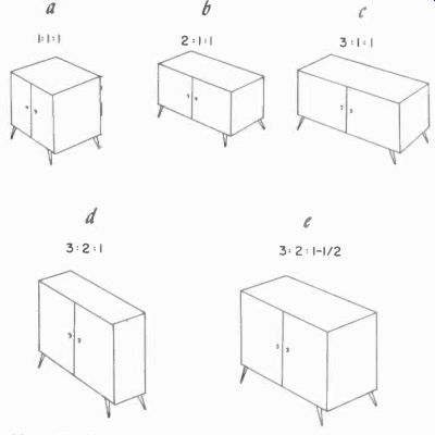
Fig. 1009. The same volume of enclosed space can look quite different,
depending on the proportions of the enclosing form.
For our purposes, functional differences are rare and unimportant.
Granted, occasionally one encounters a piece, say an Early Colonial "dry sink", that performs a function not found anywhere in other styles. For example, Sheraton never produced any piece with the same function for the good and sufficient reason that his clientele had no need for it.
But a chest of drawers, be it Sheraton, Directoire, Regency or Early Colonial, performs essentially the same function in essentially the same way, regardless of style. The differences that distinguish them stylistically from one another lie in variations in the use of design elements.
Form and proportion can enter into the delineation of style in several ways. The turning, fluting or curving of a leg is a matter of form. The height of a leg relative to its thickness and the height of a leg relative to the height of the cabinet are matters of proportion. Whether a cabinet has legs or a base, whether the top over laps the sides or comes flush, whether the front is flat or curved, the relation of overall height to length; these are all matters of form and proportion. The manner in which they are handled will vary in typical ways from one style to another.
Decorative detail
Hardware, inlay work, moldings, beading and carving are all part of the decorative detailing of furniture. The amount, kind...
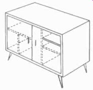
Fig. 1010. Irregular internal subdivisions shown with dashed
lines. Such regular rectangular forms look better with irregular
subdivisions hidden.
...and placement of such detailing is highly significant in the determination and quality of styling. Fig. 1011 shows a variety of details from several styles.
The type of decoration is so important to the determination of style that you could take a basic cabinet and, by merely changing the decorative details, come up with very accurate reproductions of at least a half dozen or more different styles. Variation of the doors alone (Fig. 1012) is very effective.
Specific styles
The number of furniture styles that have been developed in just Western Europe and the United States is pretty staggering without considering the rest of the planet. However, the ones, out side of Modern and Contemporary, that remain sufficiently popular in the United States to warrant consideration here, were all developed during a period extending roughly from 1700 to 1820.
Styles from both before and after that period are now quite rare.
We'll discuss first Modern and Contemporary styling, then the eight most important styles from the period just mentioned. Once you are acquainted with these styles, you'll find that 95% of the time you are on familiar ground.
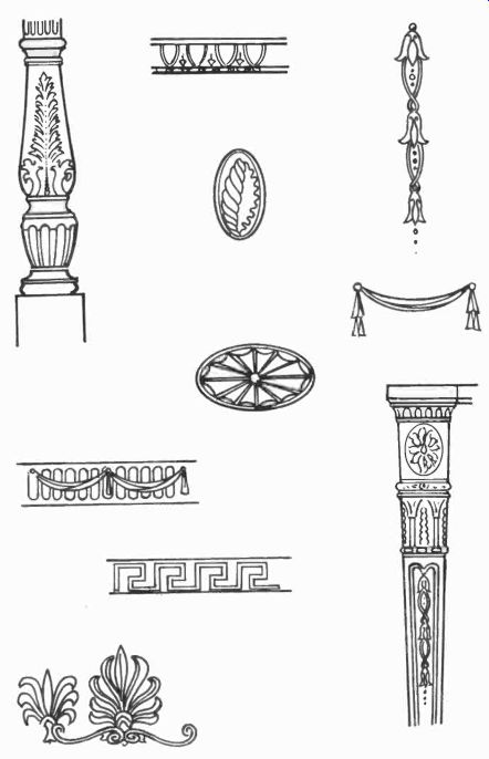
Fig. 1011. A few decorative details from various styles.
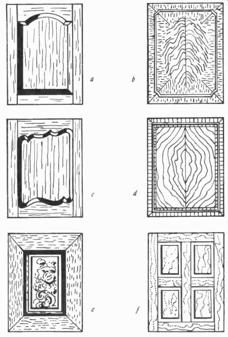
Fig. 1012. Some typical panels: (a) Jacobean English, (b) Hepplewhite,
(c) French Provincial, (d) Sheraton, (e) Louis XIV and (f) American
Colonial.
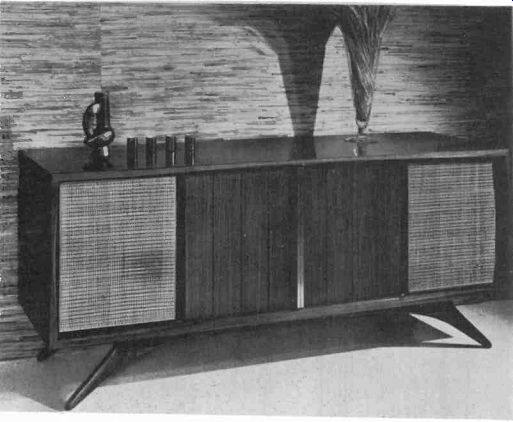
Fig. 1013. Modern cabinets like this one are characterized by lack
of decorative detail and highly functional appearance. (Grosfeld House.)
Modern
This is, of course, the style of the present day, of our time, and as such is in a state of constant change and development.
This makes it a good deal more difficult to define and analyze than the styles of the past. They are neatly pickled in the formaldehyde of history and will stand still while we study them. Modern won't.
However, we can identify some general characteristics of Modern cabinets that will enable you to distinguish them readily from any in the historical styles. The most striking feature of Modern is the extreme sparseness and simplification of decorative detail.
Fig. 1013 shows an example of this. Carved floral and classical motifs have entirely disappeared, and inlay work is virtually non existent. What little does appear is of the simplest kind and usually on doors only.
Some critics of the style have attributed this disappearance of ornamentation to a lamentable lack of imagination on the part of the designers. We do not agree. We find in it an accurate reflection of aspects of our contemporary ways of thinking and living.
Whether these ways are good, bad or indifferent is not the point.
Ornamental design has been replaced by a strong emphasis on natural wood grains and colors, and the use of contrasting materials and textures (Fig. 1014). As a result, a number of woods and other materials, some natural and some synthetic, not previously used in furniture, have made their appearance.
A highly distinctive feature of Modern styling is the introduction of asymmetrical design. Most period furniture was designed so that starting with a vertical line down the middle, either side of a ...
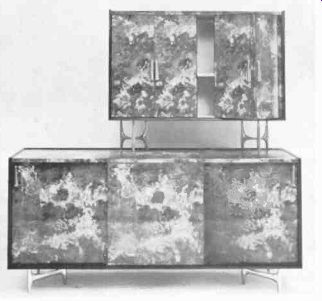
Fig.
1014. Highly contrasting wood grains and colors can offset lack of
ornamentation. (Charak Furniture Co.)
... cabinet would be a mirror image of the other. In Modern (Fig. 1014) this bilateral symmetry is often ignored, if not purposely avoided.
Modern cabinets are generally raised off the floor on legs to give a feeling of lightness. Staining or bleaching of woods is relatively uncommon, in keeping with the emphasis on natural colors, and finished surfaces of a satin or dull texture are preferred over a high gloss.
Contemporary
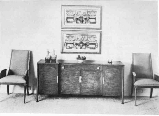
Fig. 1015. Contemporary style generally reflects some period influence.
Here the reference is classical. (John Scalia, Inc.)
It is often difficult not only for the layman, but even for the professional, to draw a sharp line between Modern and Contemporary styling. The most important, but not always the most obvious difference, is that Contemporary designs will always contain some reference, veiled or otherwise, to a period influence. In Fig. 1015, this reference is classical, but beyond that we're too cowardly to attempt an identification, while Fig. 1016 shows a readily visible Chinese influence.
Contemporary styling adheres to bilateral symmetry in design and employs more decorative detailing than Modern. Cabinets will more often run down close to the floor on 2- to 4-inch-high bases.
Coloring of woods by bleaching and staining is more common, and there is a good deal more use of high-gloss finishes.
Unfortunately, in hi-fi and TV, a great deal of uninspired, if not downright incompetent Contemporary design, has been used in abortive attempts to arrive at a "universal compromise" that will fit satisfactorily with many styles of decor. Too often the result has been cabinets that esthetically don't really fit well with any thing, not even themselves. It usually requires a bit more effort to work out something that really fits with a given decor than to settle for a "universal compromise", but the improvement in the finished job is worth the trouble (Fig. 1017).
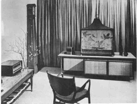
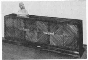
Fig.
1016. Chinese Influence is fairly obvious is the modern installation above.
(Harmon-Kardon. Inc.) Oriental reference is somewhat more subtle in the con
temporary piece shown below. (Charak Furniture Co.)
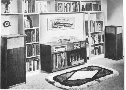
Fig. 1017. The simple and unadorned lines of modern furniture are
especially adaptable to interiors that do not have any particular period
influence. (Harman-Kardon, Inc.)
Traditional
Like Modern and Contemporary, Traditional and specific period styles are not always easy to distinguish from each other, particularly if the period piece is a reproduction. Modern reproductions of period pieces usually involve some simplification of decorative detail and a consequent loss of some identifying characteristics.
The simplest distinction between Traditional and specific period pieces is, unfortunately, one that won't help much until you're reasonably well-acquainted with period styles. The distinction is that a Traditional piece will have characteristics of more than one style.
As with Contemporary, a good deal of hi-fi and TV cabinetry has been done in Traditional style in an attempt to bridge gaps and blend styles, with something less than brilliant results. Eclectic design mixing styles in a single cabinet is most difficult, but many manufacturers would rather wrestle with that problem than the problem of stocking several distinctive styles.
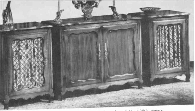
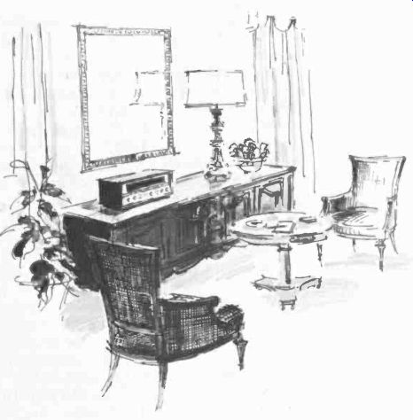
Fig. 1018. French Provincial is a simplified version of the highly
ornate court styles of Louis XIV. Compound curves as illustrated above
are especially typical of this style.
(Furniture Craftsmen.) The lower photo illustrates how some types of high-fidelity equipment blend with French Provincial.
French styles
At the beginning of the period we are going to discuss, from 1700 to 1820, the only style that was of any importance to the French was that of the court of Louis XIV. It is of no importance to us.
Why? Because it was a pompous, flamboyant, heavy, ornate design that has fallen completely out of favor and is virtually unused today. So has the lighter and more subtle style of his successor, Louis XV.
However, during this period, a style was developing in the out lying districts of the country that is of importance today--French Provincial. The provincials wanted very much to ape the court style but, since the country bourgeoisie just couldn't afford to go whole hog, the result was necessarily a simplified version. Fig. 1018 shows examples. If you will note the compound curves of aprons and tops, the inset panels in the doors, and the reverse-curved cabriole legs blending into the curves of the bottom of the apron, you are not likely to confuse this style with any other. The en forced relative simplicity of ornamentation and the resulting graceful forms are the features that have enabled Provincial furniture to survive, while the over-ornamented and rather vulgar court prototypes have disappeared.
By the time of Louis XVI, the court style had become quite frivolous and dainty, in keeping with the empty-headed, feeble court that supported it. With the lopping of Louis' head, both the style and Louis came to a sudden end.
The style of the Directoire that followed was a complete contrast (Fig. 1019). The Greco-Roman ideals of the time produced dignity and restraint. The graceful curvilinear forms of the court style are gone, but so is the ostentatious over-ornamentation. Directoire was sober and self-conscious, but not yet self-important. The application of flat pilasters or fluting reminiscent of classical columns was common. These and simple geo metric shapes form the main decorative effects. The profuse rococo floral patterns of the court are entirely eliminated. Simple rectangular forms without decorative moldings or carving are the order of the day. Some ornamentation appears in the hardware, but again it is largely geometric.
The Directoire ends with the rise of Napoleon and, as a result of his influence, the Empire style appears (Fig. 1020). What was a moderate self-consciousness in the Directoire becomes self-importance in the Empire. Napoleon was a somber and rather pompous little guy, and his style reflects this. It has become heavier and more ornate. While the classical influence remains, it seems to have become more Roman than Greek. Although the veneer work stays basically geometric, it has become more complicated and purely ornamental brass work or ormolu has been added. The Empire style, like Napoleon and his appointed aristocracy, lacked the grace and subtlety of the old hereditary nobility. But, while ...
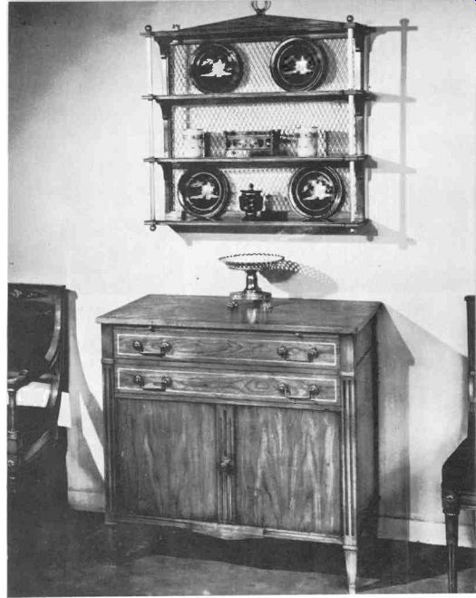
Fig. 1019. Like the French Revolution that caused it, the Directoire
style is completely opposed to the ornateness of Louis' court. Directoire
presents a square appearance and an almost Spartan simplicity. (John
Scalia, Inc.)
... it may at times have become pretty bombastic, the Empire never became weak, effeminate or just plain silly, as the Bourbons did both before and after Napoleon.
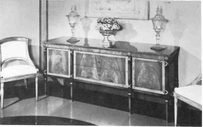
Fig. 1020. Empire style retains the basic squareness and simple lines
of Directoire, with some small added ornamentation and brassware. The
heavy stumplike legs add a feeling of massiveness to the piece. (Grosfeld
House.)
After the fall of Napoleon and the end of the Empire, French furniture design falls into a decline that it is kinder not to trace.
It rests in well-deserved obscurity.
English styles
In England, the best and most important styles were the work of individual designers--rather a contrast with France, where the styles were the result of the work of groups of designers, none of whose names are readily discovered.
The first of the important English stylists was Thomas Chippendale. He was actually more of an adapter than an original designer, in that the most striking characteristics of his styles were based on the Louis XV style in France and the Queen Ann style that preceded him in England. In cabinets, his style was a bit heavy and over-ornamented by contemporary standards. Consequently, his pieces as reproduced today (Fig. 1021) are simplified versions of the originals.
If you should run into an original, the apron at the base of the cabinet will be richly carved, and there will be little or no inlay work. The curves of the top and front as shown are typical Chippendale, as is the general proportioning. On smaller cabinets with legs, Chippendale commonly used a curved or cabriole leg heavily carved and often terminating in a carved ball-and claw-foot.
Elaborate carving as a form of decoration virtually disappeared after the time of Chippendale until it was reintroduced in the ...
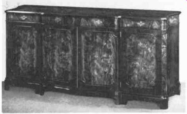
Fig. 1021. Simplified versions of Chippendale are still being manufactured
today, although this style enjoyed a far greater popularity several
decades ago. (Schmieg and Kotzian, Inc.)
... Victorian era, a time when design of all kinds in England reached a nadir seldom equaled anywhere at any time.
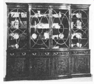
Fig. 1022. Hepplewhite is another important English furniture style.
Note the use of ovals in the design. (John Scalia, Inc.)
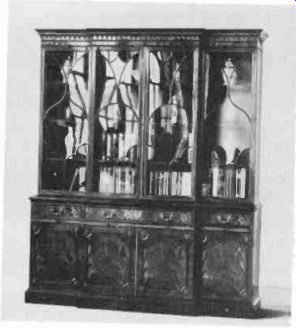
Fig. 1023. Sheraton is closely related to Hepplewhite, and it is often
difficult to distinguish one from the other. Characteristic of Sheraton
are the contrasting wood-panel inlays. (John Scalia, Inc.)
After Chippendale, furniture design in England had its Golden Age in the styles of Hepplewhite and Sheraton. In the hands of these great designers, English styling reached heights of refinement and delicacy that have never been equaled, let alone surpassed. Although the overall styles of these two designers were quite distinct, their cabinets were sufficiently similar to make it fairly difficult to distinguish one from the other readily. This is particularly true of contemporary reproductions where minor simplifications of characteristic detailing, which are common, can greatly cloud the issue. Both men had a strong feeling for wood.
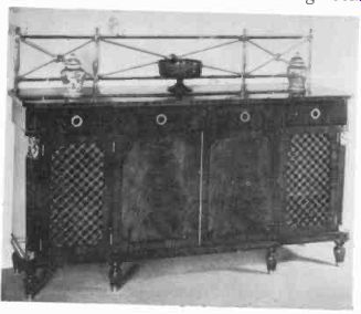
Fig. 1024. Derived from Empire, English Regency style is bombastic
and elegant. (John Scalia, Inc.)
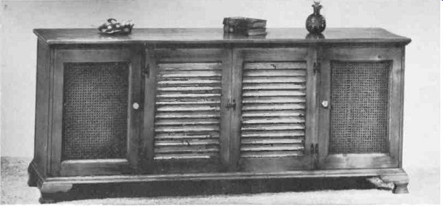
Fig. 1025. The only completely American style is Early Colonial, frequently
called Early American. Dating from the late 1600's, Early American
embodies simplicity and functionality. The curved short legs are just
about the only concession to stylization. (Furniture Craftsmen.) and
the beauty of wood grains, a subtle eye for proportion and great restraint
in their approach to decoration. Hepplewhite (Fig. 1022) tended to
use the oval in his decorative motifs more often than Sheraton, and
was inclined toward a slightly larger proportion of width to height
in his overall dimensioning.
Sheraton (Fig. 1023) preferred rectangular motifs in his inlays, and for them, liked somewhat more contrasting woods and grains than Hepplewhite. Sheraton's proportioning was narrower and higher than Hepplewhite's and he often emphasized this by using elaborate pediments on the tops of his high pieces.
The fact that it is a bit difficult to distinguish the cabinets of these two styles from one another also means that it is not terribly important, particularly for hi-fi housings, to be able to do so. As long as you can tell that a given piece is Hepplewhite or Sheraton and not something else entirely, you're all right.
After Hepplewhite and Sheraton, the influence of the Empire of France became felt in England in the form of the Regency style.
English Regency (Fig. 1024) begins to reflect a bombast akin to that of the Empire, and in the process necessarily loses some of the very sophisticated gracefulness of Sheraton and Hepplewhite. But Neo-Classicism was rampant throughout Europe, and England was not immune.
The English, however, did manage to avoid the depths of vulgar pomposity occasionally reached by those across the Channel.
The previous finesse in decorative detailing also slumps somewhat in Regency design, but it does not become really clumsy. Regency represents to us a definite retreat from the high point of Hepplewhite and Sheraton, but it is not yet a rout.
The real disaster occurs later in the Victorian period, and when it came it was of monumental proportions. The best thing that can be said of Victorian furniture is absolutely nothing, and the best thing we can think of to do with it is try to forget it ever happened.
American styles It comes as rather of a shock to many Americans to discover that throughout most of our national history, our furniture styles at any given time have been merely rehashes of those current in England 10 to 20 years earlier.
The very early period of colonization was an exception. At that time, the American colonists developed of necessity a definite style of their own, albeit based on Jacobean English prototypes.
The conditions of frontier living required furniture that served functions not needed in civilized England. These pieces had to be invented. The materials available and the general level of craftsmanship also differed from the homeland, all of which contributed to the development of a local provincial style in keeping with local needs and conditions.
Fig. 1025 shows examples of this style. Pine was the most common material, although birch, maple and fruitwoods were also used. Simple, straight cabinet lines, doors with plain rectangular inset panels, short, heavy curved legs and very sparse decoration were typical.
As the colonies grew, this style faded into a welter of copies of English and occasionally French styles. Nothing indigenously American reappears until modern times, and whether our Modern styling is American or International is a moot question.
Remember that we haven't pretended to cover all of the furniture styles you'll ever encounter. But the styles covered will constitute more than 90% of the furniture you'll see. Going out and seeing examples of these styles in the wood will be a great help toward getting the styles firmly fixed in your mind once and for all. A local museum or books on furniture will help with this familiarizing process. Once you've done this, you will be in a far better position to tackle the problems involved in relating a hi-fi cabinet to the rest of the furnishings in the room where it is to be placed.