by Jean Marcellino
Album covers, many of which are produced by top graphic artists, represent some of the finest commercial art today. As such, choosing "the best" of them has not been easy. All were selected from BACKBEAT'S record library, so any company having difficulty with its press mailing list may have been excluded from consideration.
I am an art director, so my criteria have been strictly aesthetic. I have not taken into account such things as market viability or the appropriateness of a jacket to its musical content or to its audience. What I did look for was freshness, impact, and overall artistry. We are bombarded by countless printed images daily, and an effective piece of art must, in some way, rise above its competitors and jolt us from our expectations. As to "artistry," anyone's perception of it is their own, and all my choices are completely subjective. Let me just say that I wish any one of these covers was in my own portfolio.
In filtering through the five or six hundred candidates several things occurred to me. For one, I think illusJean Marcellino, BACKBEAT s first art director, has designed album covers for many labels and is currently an art director for Arista records.
trated jackets have more appeal right now than photographic ones. These trends swing like a pendulum, and I say this from sheer intuition. For another, the CBS art department stood out, once again, as a leader in overall graphic excellence. Credit is due to longtime art director John Berg, who, at one time or another, has employed and inspired many of the winners, both CBS and otherwise.
This project has been great fun.
Congratulations to all of those "visual communicators" who contributed their efforts to these very beautiful packages.
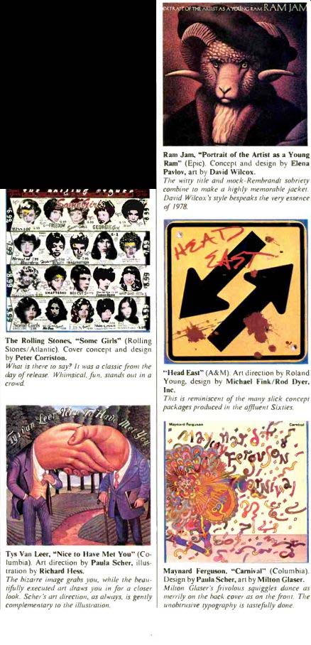
The Rolling Stones, "Some Girls" (Rolling Stones/Atlantic). Cover concept and design by Peter Corriston.
What is there to say? It was a classic from the day of release. Whimsical. fits, stands out in a crowd.
Tys Van leer, "Nice to Have Met You" ( Columbia). Art direction by Paula Scher, illustration by Richard Hess.
The bizarre image grabs you, while the beautifully executed art draws you in for a closer look. Scher's art direction, as always, is gently complementary to the illustration.
( Ram Jam, "Portrait of the Artist as a Young Ram" (Epic). Concept and design by Elena Pavlov, art by David Wilcox.
The witty title and mock-Rembrandt sobriety combine to make a highly memorable jacket.
David Wilcox's style bespeaks the very essence of 1978.
"Head East" (A&M). Art direction by Roland Young, design by Michael Fink/Rod Dyer, Inc.
This is reminiscent of the many slick concept packages produced in the affluent Sixties.
Maynard Ferguson, "Carnival" ( Columbia). Design by Paula Scher, art by Milton Glaser.
Mi/to i Glaser's frivolous squiggles dance as merrily on the back cover as on the front. The unobtrusive typography is tastefully done.
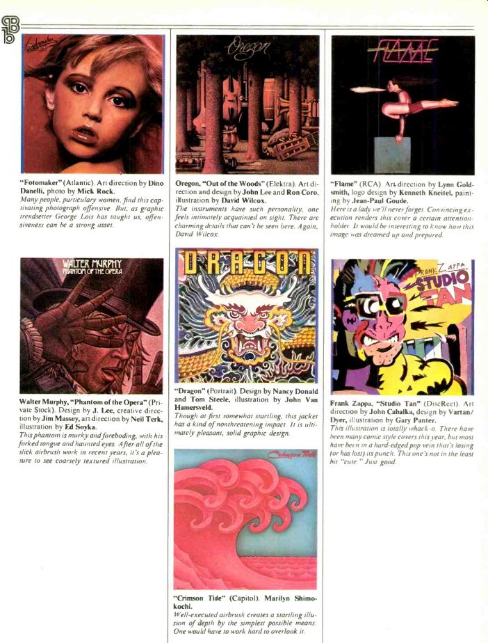
a "Fotomaker" ( Atlantic). Art direction by Dino Danelli, photo by Mick Rock.
Many people, particularly women, find this captivating photograph offensive. But, as graphic trendsetter George Lois has taught us, offensiveness can he a strong asset.
--WALTER MURPHY
Walter Murphy, "Phantom of the Opera" (Private Stock). Design by J. Lee, creative direction by Jim Massey, art direction by Neil Terk, illustration by Ed Soyka.
This phantom is murky and foreboding, with his forked tongue and haunted eyes. After all of the slick airbrush work in recent years, it's a pleasure to see coarsely textured illustration.
Oregon, "Out of the Woods" (Elektra). Art direction and design by John Lee and Ron Coro, illustration by David Wilcox.
The instruments have such personality, one feels intimately acquainted on sight. There are charming details that can't be seen here. Again, David Wilcox.
"Dragon" (Portrait). Design by Nancy Donald and Tom Steele, illustration by John Van Hamersveld.
Though at first somewhat startling, this jacket has a kind of nonthreatening impact. It is ultimately pleasant, solid graphic design.
"Crimson Tide" (Capitol). Marilyn Shimokochi.
Well-executed airbrush creates a startling illusion of depth by the simplest possible means.
One would have to work hard to overlook it.
"Flame" (RCA). Art direction by Lynn Goldsmith, logo design by Kenneth Kneitel, painting by Jean-Paul Goude.
Here is a lady we'll never forget. Convincing execution renders this cover a certain attention-holder. It would be interesting to know how this image has dreamed up and prepared.
Frank Zappa. "Studio Tan" (DiscReet). Art direction by John Cahalka, design by Varian/ Dyer, illustration by Gary Panter.
This illustration is totally whack-o. There have been many comic style covers this year. but most have been in a hard-edged pop vein that's losing for has lost) its punch. This one's not in the least bit "cute." Just good.
-------------
(High Fidelity, USA print magazine)
Also see: